
Définir sa cible marketing : les informations à connaître avant de communiquer

Équipe marketing analysant différents profils de clients et leurs besoins.

Commencer par le besoin, pas par l’âge L’âge, le sexe ou la ville peuvent être utiles, mais ils ne suffisent pas. Cherchez surtout à comprendre le problème que la personne veut résoudre, ce qu’elle essaie d’obtenir et ce qui l’empêche d’avancer. Identifier la situation actuelle Dans quel contexte votre cible se trouve-t-elle aujourd’hui ? A-t-elle […]

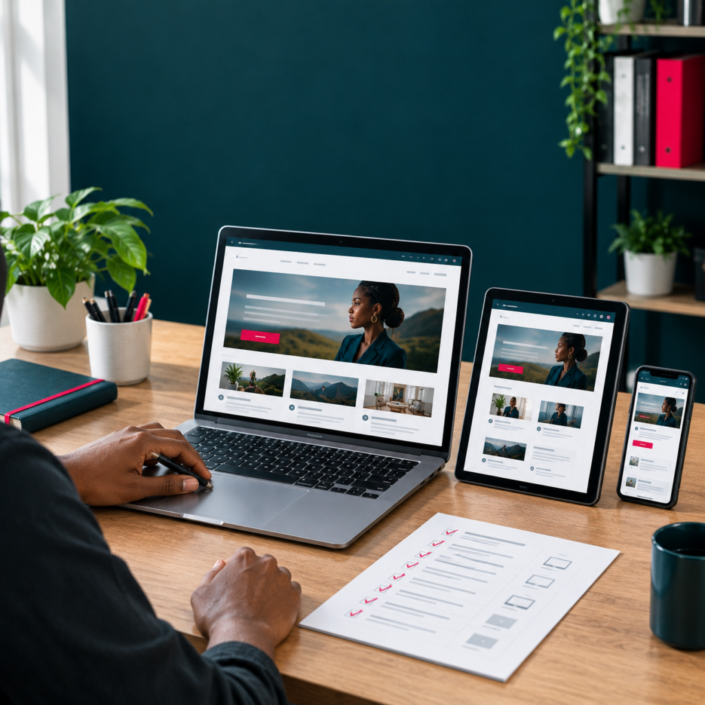
 Responsive design : la checklist à vérifier avant de publier un site
Create an ultra-realistic, premium editorial photograph for a professional French-language blog article. The final image must look like a real high-budget commercial photoshoot commissioned by a respected digital training organization, not like AI concept art or a generic stock image. Final canvas: square 1:1, 1600x1600 pixels, suitable as the featured image of a WordPress blog article and still visually clear as a small thumbnail. ART DIRECTION: Use a coherent Simplon-inspired visual system without displaying the Simplon logo. Deep charcoal teal #00313C should structure the environment and devices; vivid red #E40046 should appear only as a controlled accent, around 5–10% of the image; use warm white, paper white and subtle neutral grays for balance. The result should feel modern, rigorous, inclusive, digital, practical and human. Avoid generic blue SaaS imagery, rainbow palettes, heavy gradients or excessive visual effects. PHOTOGRAPHIC REALISM: Every material must behave like a real physical material. Skin must show natural texture. Paper must have subtle fiber, thickness and believable folds. Screens must have realistic brightness, reflections and viewing angles. Metal, glass, fabric and desk surfaces must react correctly to light. Shadows must match the direction and softness of the light sources. Devices must have plausible proportions and perspective. Nothing should float unless physically supported. LIGHTING: Use soft natural daylight entering from one side at approximately 45 degrees, combined with a very subtle studio fill. Preserve natural contrast and soft-edged shadows. Avoid overexposed highlights and overly dark shadows. Screen brightness must stay realistic. White balance should remain neutral to slightly warm, similar to premium editorial photography for a business or technology magazine. CAMERA: Simulate a professional full-frame camera with a 45–55mm prime lens, around f/3.2 to f/4.5, ISO 100–250, natural perspective and a controlled three-quarter angle slightly above desk level. Use realistic optical depth of field: the main subject, hands and primary device must be tack sharp, while background objects soften gradually. Avoid fisheye, ultra-wide distortion, extreme top-down flat lays and artificial perspective. COMPOSITION: Use a clear commercial hierarchy. The main subject and central concept should occupy one rule-of-thirds intersection. Keep props limited and purposeful. Preserve approximately 25–30% clean negative space in the upper-left or upper-right region for a French headline that will be added later in design. Do not generate the headline inside the image. The image must remain understandable when reduced to a WordPress blog thumbnail. HUMAN REPRESENTATION: When people appear, prioritize realistic West African professionals and learners in a contemporary, credible working environment. Natural dark skin tone and texture, anatomically correct hands, believable expressions, normal posture and professional but accessible clothing. Avoid beauty-retouched skin, influencer posing, exaggerated smiles, staged handshakes or tokenistic imagery. INTERFACE AND TEXT RULES: Interfaces may contain realistic generic panels, cards, graphs, website sections, checklists or planning structures appropriate to the subject, but must not copy a real product exactly. Use abstract typographic lines or blurred/unreadable text. Do not generate readable French or English copy, fake brand names, random letters or fake URLs. ARTICLE-SPECIFIC SCENE: Create an ultra-realistic premium editorial photograph for a blog article about responsive web design testing. Square 1:1, 1600x1600. Show a professional web-design workspace with one laptop, one tablet and one smartphone displaying the same generic website adapted correctly to three screen sizes. The laptop shows a desktop layout with multiple columns, the tablet shows a simplified intermediate layout and the smartphone shows a clean single-column mobile version. Add a small printed checklist with abstract check marks for typography, spacing, images, buttons, menu and forms. No readable words. STRICT NEGATIVE CONSTRAINTS: no readable text, no spelling mistakes, no fake brand names, no logos unless explicitly required, no Simplon logo, no WordPress logo, no Elementor logo, no WooCommerce logo, no Google logo, no Meta logo, no LinkedIn logo, no WhatsApp logo, no OpenAI logo, no watermark, no signature, no QR code, no floating interface panels, no holograms, no neon cyberpunk lighting, no robots, no glowing brain, no giant icons, no exaggerated arrows, no floating charts, no plastic 3D render look, no low-poly objects, no cartoon style, no anime style, no generic stock-photo cliché, no over-saturated colors, no extreme HDR, no heavy vignette, no messy random desk, no duplicate devices, no warped screens, no impossible reflections, no perspective errors, no deformed fingers, no extra fingers, no merged hands, no distorted faces, no waxy skin, no unnatural smiles, no duplicated props, no clipped objects at awkward edges. The final result must be elegant, credible, restrained, photorealistic, culturally plausible and immediately usable as the featured image of a premium professional blog article. Use Simplon-inspired brand colors subtly: dark #00313C, red #E40046 accents, warm white and neutral grays. High-end commercial technology photography, soft daylight from the side, subtle fill, accurate reflections, realistic device proportions and premium desk textures. Simulate a full-frame camera with a 50mm lens, f/4, natural three-quarter angle and gentle depth of field. The three devices must remain visually coherent and aligned without looking artificially duplicated. Leave 25–30% negative space for a French title. No readable text, no logos, no floating devices, no warped screens, no duplicated UI errors, no hands unless perfectly realistic, no cyberpunk effects, no gradients dominating the scene, no watermark, no obvious AI artifacts.

Vérifier la largeur des contenus Les blocs doivent rester lisibles sans dépasser l’écran. Sur mobile, les colonnes doivent généralement s’empiler dans un ordre logique. Adapter la typographie Les grands titres peuvent devenir disproportionnés sur téléphone. Vérifiez la taille, la hauteur de ligne et la longueur des lignes de texte. Contrôler les espacements Des marges généreuses […]

Créer une fiche produit WooCommerce qui donne envie d’acheter
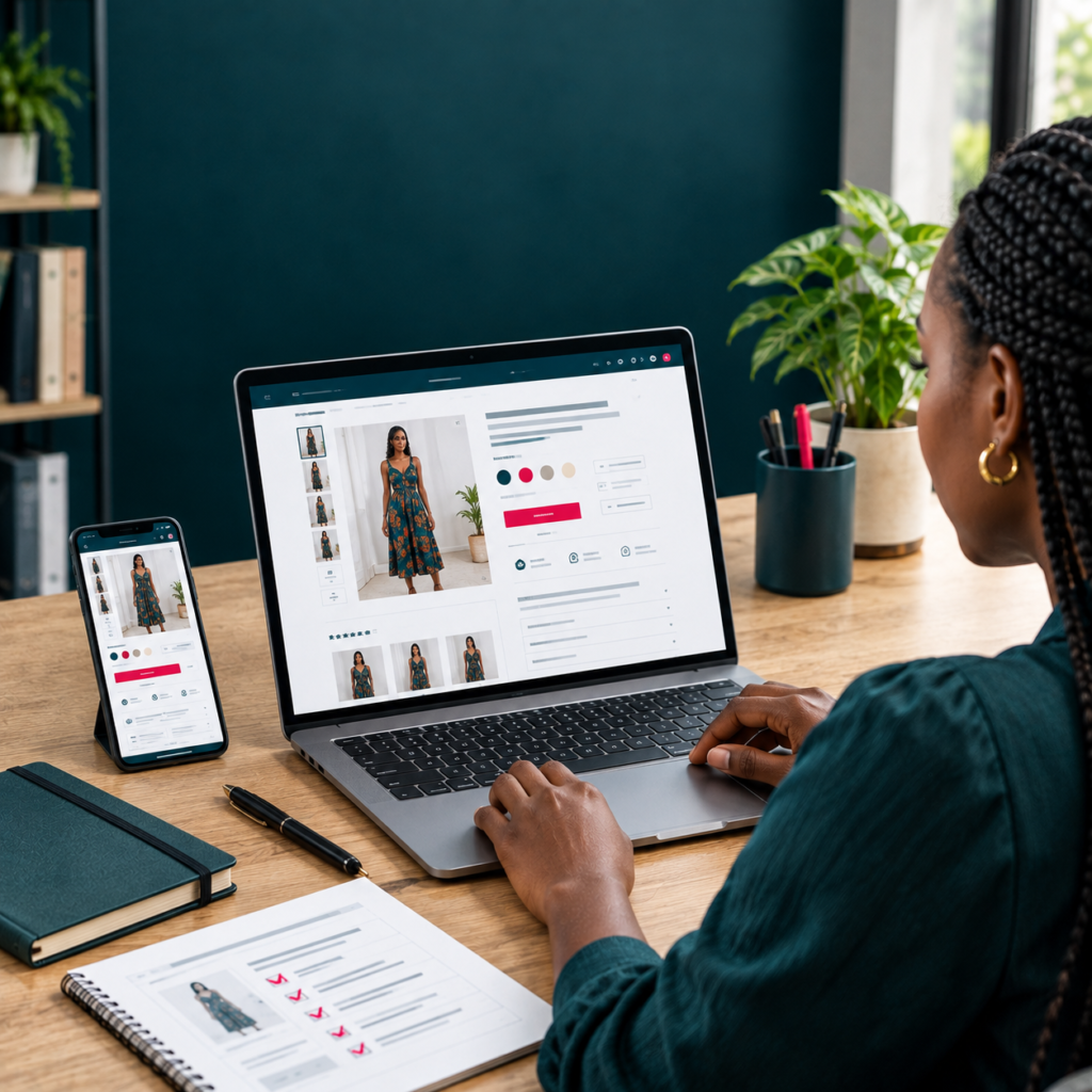
Boutique WooCommerce professionnelle avec une fiche produit claire et structurée.

Commencer par un nom clair Le nom doit permettre de comprendre immédiatement ce qui est vendu. Évitez les titres trop créatifs qui obligent le visiteur à lire toute la page pour comprendre le produit. Soigner l’image principale L’image principale attire le regard avant le texte. Elle doit être propre, cohérente avec le reste de la […]

Pourquoi les couleurs et typographies globales sont indispensables dans Elementor
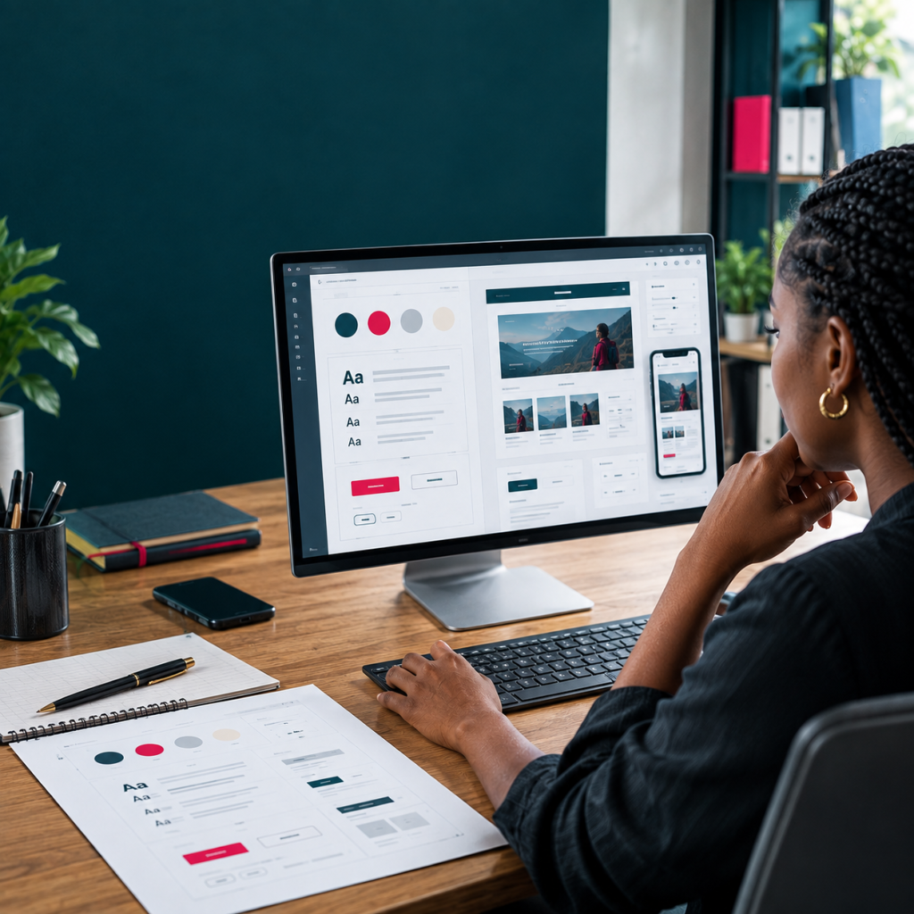
Interface de design web montrant un système cohérent de couleurs et typographies.

Un site doit fonctionner comme un système Les couleurs et typographies globales permettent de définir des règles communes pour tout le site. Vous décidez une fois de la couleur principale, secondaire, du texte et de l’accent, puis les éléments du site utilisent ces références. Pourquoi éviter les réglages manuels partout Si trente boutons utilisent chacun […]

10 erreurs fréquentes des débutants sur WordPress et comment les éviter
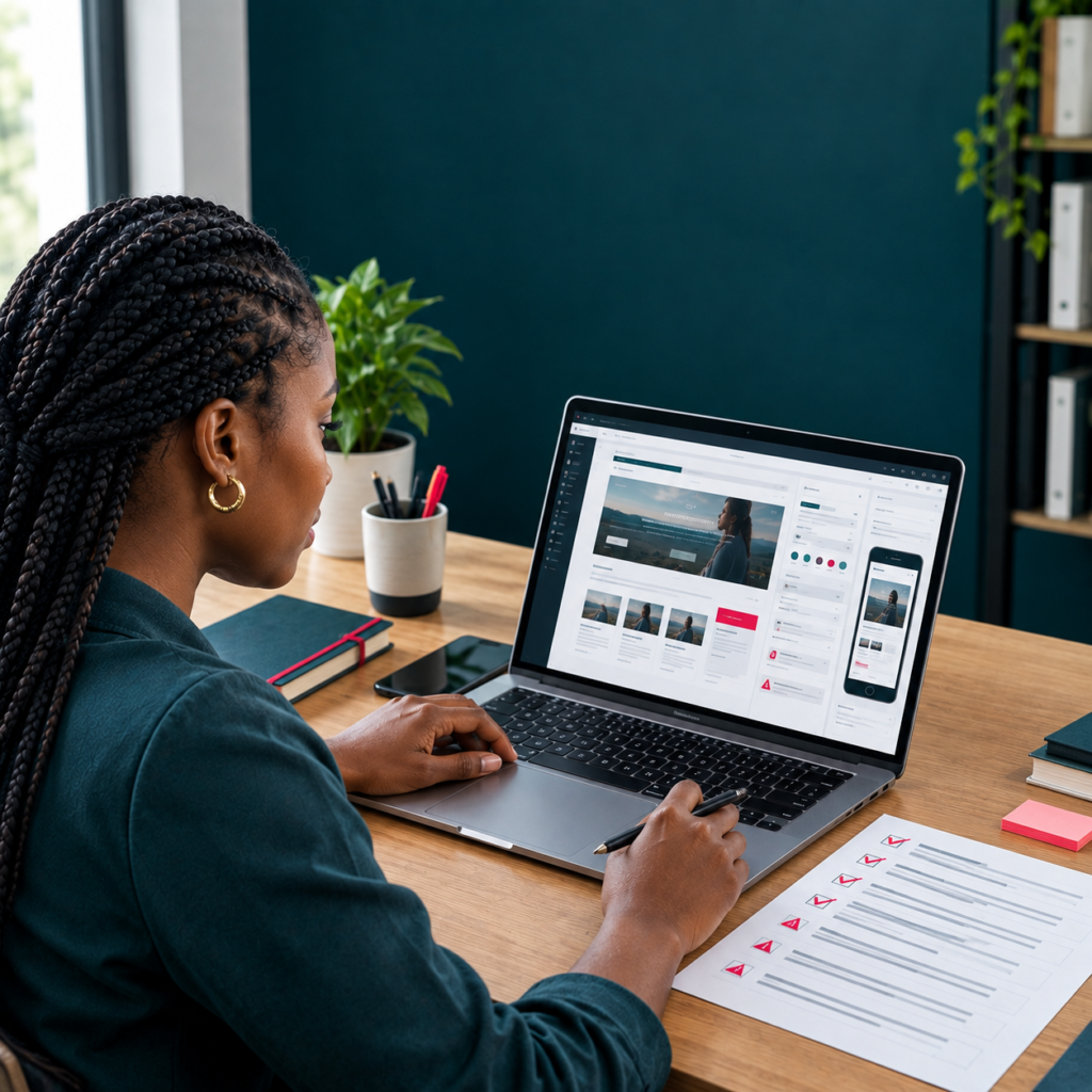
Développeur WordPress examinant une checklist d’erreurs à éviter.

Installer trop d’extensions Ajouter une extension pour chaque petit besoin peut vite rendre le site difficile à comprendre et à maintenir. Avant d’installer, vérifiez si WordPress, votre thème ou une extension déjà présente propose la fonction recherchée. Commencer le design avant les réglages globaux Modifier les couleurs et polices section par section semble rapide au […]

Créer un site WordPress professionnel : les 10 étapes à suivre dans le bon ordre
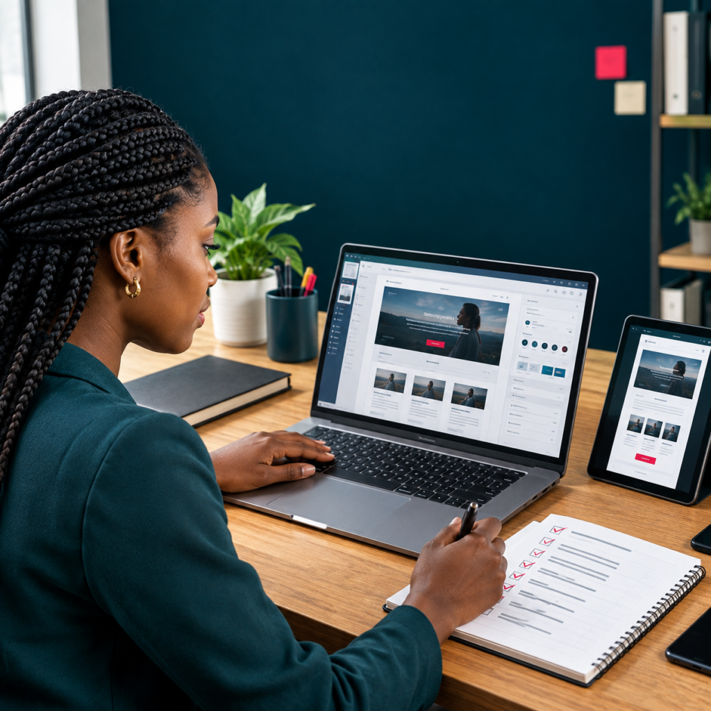
Professionnel travaillant sur la création structurée d’un site WordPress.

Commencer par l’objectif du site Avant de toucher à WordPress, il faut savoir ce que le site doit permettre de faire. Présenter une entreprise, recevoir des demandes de devis, vendre des produits, prendre des rendez-vous ou publier du contenu ne demande pas exactement la même structure. Définissez donc l’objectif principal, les utilisateurs visés et l’action […]